Introduction
Picture this common scenario. You are waiting in a busy line at a coffee shop. You pull out your phone to quickly check out a local business website. The page finally loads, but the text is absolutely tiny. You have to aggressively pinch and zoom just to find their basic phone number. It is an incredibly frustrating experience. You immediately hit the back button and leave. That business just lost a paying customer in seconds. This happens millions of times every single day. This is exactly why responsive design is absolutely crucial for your survival. Your website must adapt smoothly to human behavior and varying devices instantly. In this guide, we’ll cover...
1. The Shift to Mobile Browsing
Mobile phones absolutely rule the modern digital world. Over half of all global web traffic now comes directly from smartphones. People actively shop, read, and browse while constantly on the go. If your site only looks good on a massive desktop monitor, you have a massive problem. Human attention spans are drastically shrinking every single year. We naturally crave instant information without any annoying friction.
- Instant Gratification: Users expect seamless mobile experiences immediately.
- Zero Tolerance: They simply will not wait for a clunky, broken site to load.
You absolutely must adapt to exactly where your customers already are.
2. What Is Responsive Design Exactly?
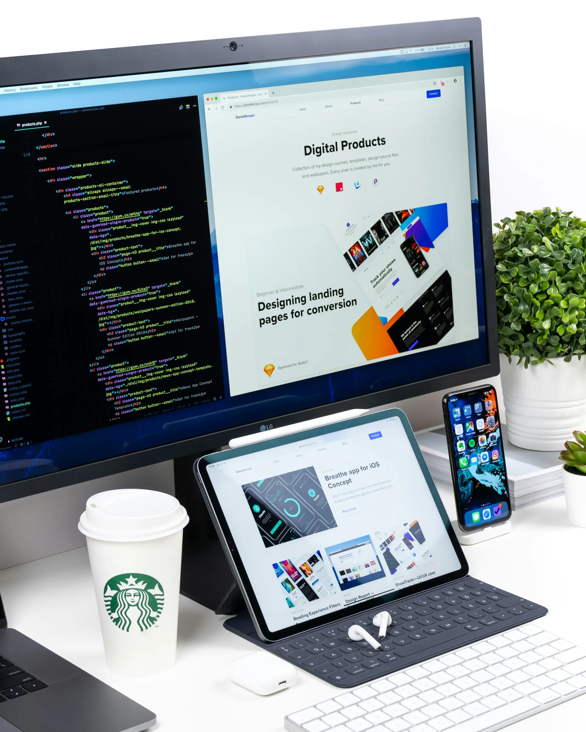
So, how does this incredible technology actually work? In basic terms, it is a highly smart, intuitive way of coding your website. It allows your digital pages to fluidly adjust to any screen size. Whether a user is on a 4-inch phone or a 27-inch monitor, the visual layout changes automatically. Images quickly resize. Heavy text blocks shift naturally. Complex navigation menus magically turn into easy-to-tap icons. You might frequently hear people ask, What are responsive design? It is simply the modern gold standard for building websites. You no longer need to manage a completely separate "mobile version" of your site. This smart, unified approach easily saves you time, money, and endless technical frustration.
3. Google Prefers Mobile-Friendly Sites
Google's primary business goal is to perfectly serve its daily users. Since most people search on mobile, Google completely rewrote its ranking rulebook. They introduced a strict system called mobile-first indexing. This simply means Google closely evaluates the mobile version of your site before the desktop version. If your mobile site is broken, messy, or slow, your search rankings will violently plummet.
- A drop in rankings means a massive drop in free traffic.
- Less organic traffic directly equals fewer valuable leads.
- Fewer daily leads mean significantly less revenue for your business.
It is a very simple, incredibly brutal domino effect.
4. Faster Loading Times Matter
Patience is a highly rare commodity on the modern internet. If your website takes more than three brief seconds to load, most people will just bounce. Mobile users are very often relying on spotty cellular networks. They rarely have the luxury of lightning-fast fiber internet everywhere they travel. A modern, highly adaptable website is fundamentally built for raw speed. It automatically compresses large background images for much smaller mobile screens. Speed absolutely kills the local competition. When your site magically loads instantly, busy visitors safely stay highly engaged. They comfortably read your content, easily view your products, and ultimately convert into buyers.
5. Lowering Your Bounce Rate
What exactly is a website bounce rate? It is the specific percentage of people who leave your site after viewing only one single page. A high bounce rate is a massive, flashing red flag to search engines. It clearly tells Google that users did not find what they wanted. Or, it means your site was simply far too hard to use. When a layout is not mobile-friendly, daily bounce rates absolutely skyrocket. Nobody wants to painfully squint at microscopic text just to read a blog post.
- Happy visitors will happily scroll further down your pages.
- They will comfortably click your helpful internal links.
- They will safely engage with your core brand message.
A noticeably lower bounce rate signals high trust and quality.
6. Enhancing the User Experience
User experience is essentially human psychology translated into digital web design. It is the underlying feeling a person gets when navigating your digital space. Truly great user experience feels completely invisible. Bad user experience is painfully, annoyingly obvious to everyone. When your visual layout shifts seamlessly, users instantly feel at ease. Navigation is completely intuitive. Important action buttons are exactly where they logically should be.
Designing for Touch
Desktop computers rely on a tiny, highly precise mouse pointer. Mobile phones rely on large, slightly clumsy human thumbs. Modern, flexible layouts carefully account for this psychological reality. Buttons are made much larger. Tiny clickable text links are spaced much further apart. This totally prevents the dreaded "fat finger" tap errors, making the journey totally frictionless.
7. The Cost-Effectiveness of a Single Site
Running a successful online business is already expensive enough. In the recent past, companies built two entirely separate, massive websites. They had one complex site for desktop users and a tiny, separate one for mobile. This meant double the coding, double the updates, and double the massive daily headaches. Today, that costly method is totally, completely obsolete.
- One simple domain.
- One content management system.
- One single digital source of truth.
This highly efficient setup drastically cuts down your daily development costs.
8. Social Media Traffic Demands It
Think deeply about how you actively use social media apps today. You are highly likely scrolling through Facebook or Instagram on your smartphone right now. When you click an interesting link in a post, you fully expect it to open smoothly. Over 80% of all global social media traffic is strictly mobile-based. If you are running paid social ads, a perfectly mobile-ready site is absolutely non-negotiable. Sending mobile social traffic to a clunky, broken desktop site is a massive mistake. Users will click your expensive ad, instantly get frustrated, and leave immediately.
9. Building Trust With Your Audience
Trust is the ultimate, most valuable currency on the internet. Before a stranger confidently buys from you, they absolutely need to feel secure. An outdated, totally broken website instantly silently screams "unprofessional" to the human brain. If a brand clearly does not care about their website, do they really care about their customers? That is the exact psychological leap users instantly make in milliseconds.
First Impressions Matter
It takes less than 50 tiny milliseconds for a busy user to form a solid opinion about your site. A sleek, smoothly adaptable design immediately communicates deep authority and care. It clearly shows you are active, modern, and heavily invested in your brand's image. This highly silent visual communication naturally builds deep, long-lasting trust.
10. Staying Ahead of the Competition
The internet is a fiercely, relentlessly competitive digital arena. Your biggest, wealthiest competitors are only a very quick Google search away. If a potential buyer is choosing between you and a rival, user experience is the tiebreaker. If their digital site works perfectly on a phone and yours definitely does not, they easily win. It really is that brutally, incredibly simple. Staying fully current with basic web standards is a vital defensive business strategy. It totally prevents you from slowly bleeding customers to more agile, modern competitors. You must always actively offer the absolute easiest path of least resistance.
11. Easier Website Maintenance
Your personal time is your most highly valuable daily asset. Managing a digital website should never ever be a painful, full-time technical job. With a beautifully unified layout, updating digital content is incredibly fast and easy. You publish a new blog post just once, and it looks absolutely perfect everywhere. You easily swap out a banner image, and it scales beautifully on all possible screens. There are many Things to know about responsive design., but ease of use is definitely at the top
Streamlining Your Updates
Your busy daily marketing team will absolutely thank you. No more dealing with confusing URL redirects or messy duplicate content issues. Your valuable SEO data is safely centralized into one clear, easy-to-read dashboard. This smartly makes tracking your actual growth simple, completely clear, and stress-free.
12. Conclusion: Making Responsive Design Your Priority
We have successfully covered a lot of important digital ground today. The hard data is clear, and human psychology is even clearer. People instinctively want fast, beautifully easy, and highly visually pleasing digital experiences. A beautifully fluid, highly adaptable website is the only way to deliver that consistently. It easily boosts your daily SEO, safely slashes your bounce rates, and elevates your brand trust. If your digital storefront is still hopelessly stuck in the past, it is time for an upgrade. Do not ever let clunky web design hold your amazing business back any longer. Take bold action today and fully prioritize a completely seamless mobile experience. Your active audience and your massive bottom line will deeply thank you.
Frequently Asked Questions
Everything you need to know about responsive design.